Aetna - AE 2016: Online Benefit Planning Guide
Delivering key employee benefits information in a colorful and approachable microsite.
PROJECT SUMMARY
Aetna’s Human Resources Benefits and Shared Services business area is responsible for architecting and delivering annual healthcare benefits to the company’s 40k+ employees – a daunting task to say the least. A key component of the task each year is to effectively communicate the various changes and nuances from one year to the next so that employees can make wise and educated decisions for their families.
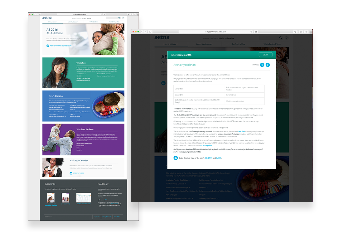
In an effort to improve the process for the coming year, Aetna was seeking to develop and deploy an informational microsite ahead of the 2016 Annual Enrollment period that would provide early details and planning tools to the company’s employees. Much of the information would be contained with various plan documents and guides typically available in PDF format. The primary goal of the initiative, therefore, would be to intuitively and efficiently drive users to the information they seek and do so in an approachable and easy to understand fashion.
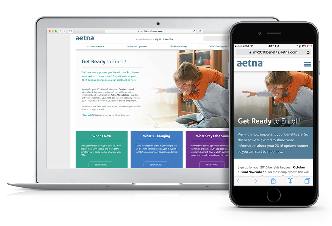
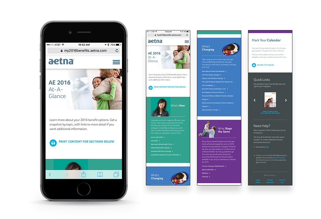
Ideally the site would be developed using a CMS backend in order to facilitate the rapid content update process that often occurs as the benefit offerings and supporting documentation are finalized. Given that the site would be used both within the Aetna firewall and at home as employees discussed their benefits decisions with their families, the site had to be developed such that it would be equally accessible on a standard-issue company laptop as well as a mobile or tablet device typically found at home.
As you can see, team VisionMix was more than up to the task, and the feedback was tremendous.
WHAT WE DID
Worked with Aetna’s internal communications and technical team members to architect a perfect and manageable technology solution
Attended brand training to ensure all design and content elements were within corporate standards
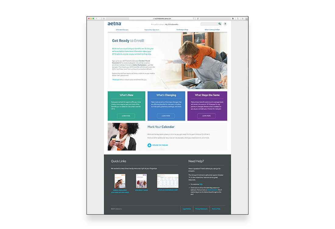
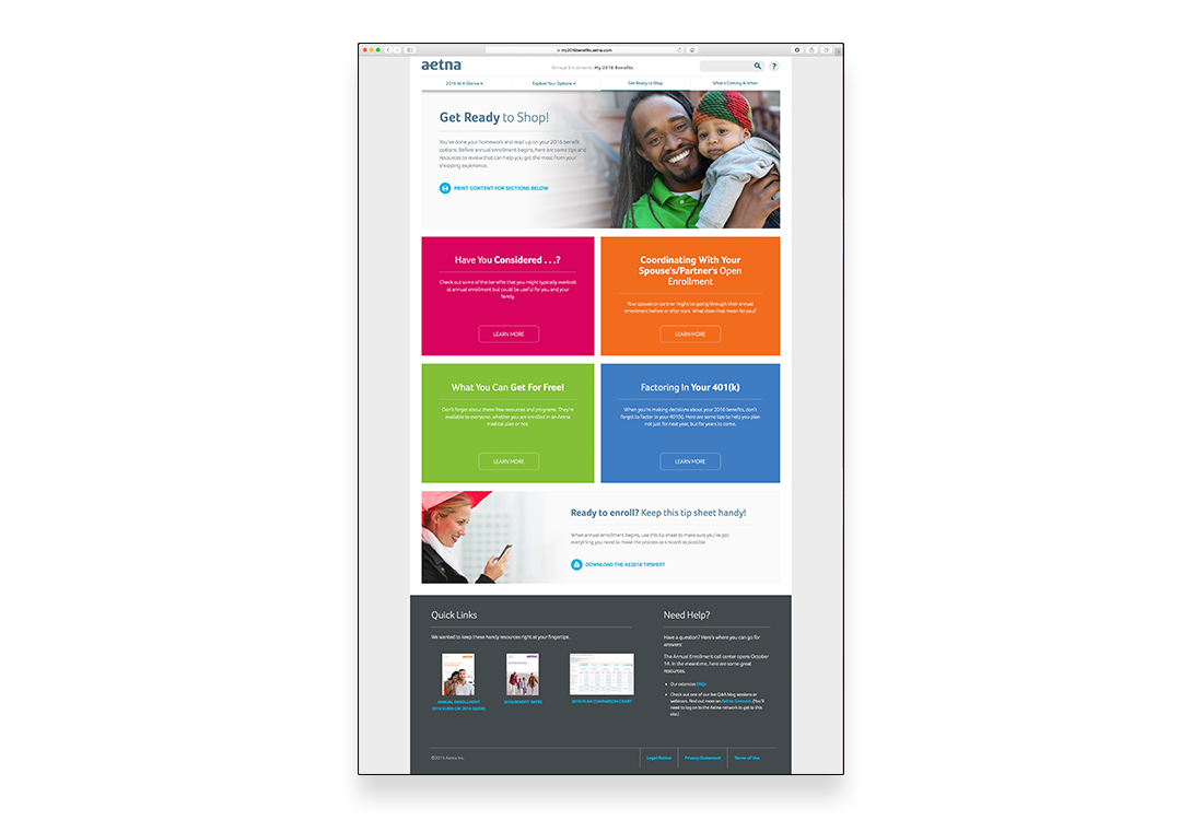
Designed and developed the microsite’s user interface and navigational shell to be approachable, simple and intuitive – driving users to the appropriate materials within a minimum number of clicks
Built the site on the WordPress CMS platform – allowing both the VisionMix and Aetna team members to collaboratively maintain the site’s content and documents
Utilized a responsive design HTML and jQuery development approach, providing a seamless user experience from desktop to tablet to mobile
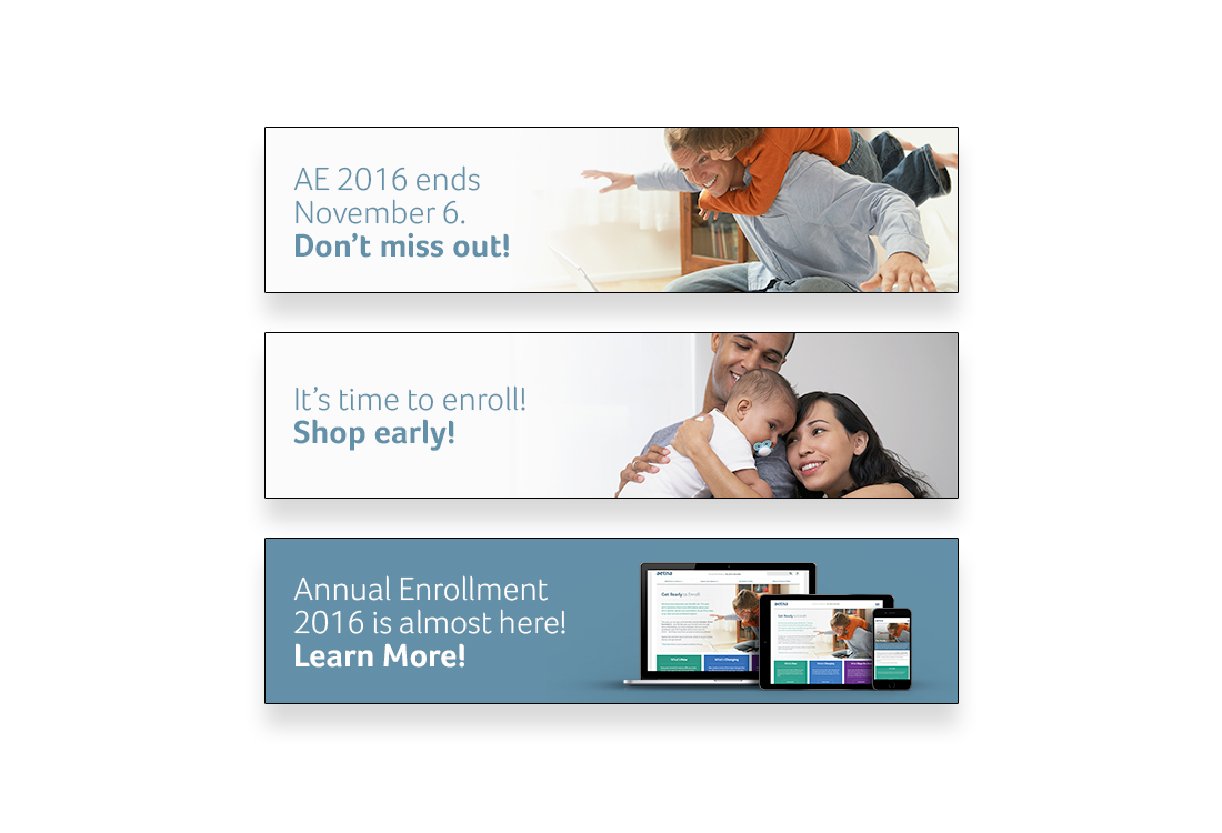
Created various web banner assets to be used within supporting / companion sites within Aetna to help generate awareness and drive traffic to the site
